- a website homepage for the band
- a digipak for the album’s release
- a magazine advertisement for the digipak"
The two we chose to do are highlighted in red.
As a part of the DigiPak, I am required to do an album cover for our music video, "Bounce" by Calvin Harris ft. Kelis. Below is my my analysis of album covers.
Analysis Of Album Covers:
Artists Faces:

One of the most popular album cover pictures is of the albums artist and their typical stereotype. Jessie J for example, her album cover is of her wearing dark colours (makeup, nail varnish, clothing) with her dark hair falling into her eyes. The photograph of her is very similar to how she is presented in the majority of her music videos such as "Do It Like A Dude" and "Price Tag". This allows the audience to easily recognise that the album is hers. The white background and her pale skin create a huge contrast between the colours which allows the gold title to stand out massively.

Amy Winehouse's album shows a quite natural photograph of her not looking at the camera with what appears to be the sea in the background. The photograph shows her famous hairstyle and eyeliner effect so that the audience can identify with whose album it is.This is quite a serene looking album cover which relates to the circumstances surrounding the albums release. The album was released a few months after her death with unreleased material that she was working on. The text is plain and in block capitals so that it is easy to see and read and it also relates to her death because of the colour connotations.

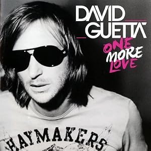


Another popular effect is the album in black and white with selected parts in colour. Example, David Guetta, Lady Gaga and Adele's albums all use this effect. Example's album has the artists name surrounded by bright yellow which would make it stand out and easy to recognise. The rest of the album cover relates to the album name "Playing In The Shadows" as his face is split into two as though a shadow has been cast upon him. The background also switches from black to white, the reverse effect that is on his face. This creates two lots of shadows with one being on his face on the right hand side and the other being in the
background on the left hand side.
Lady Gaga's "Born This Way" album consists of her face in black and white and instead of the album/artist name in colour, her lips are. The bright red of the lips has many connotations, the majority of them being centred around lust and seduction. These connotations could relate to the musical/ lyrical content of the album. Not a lot of attention if given to the titles, only to her face, and with her lips being almost exactly central, the audience's attention is drawn to that. Lady Gaga is well known for her unique sense of style and features and therefore, the album artist may have been confident that audiences would recognise her face enough to know that it is her album.
Both David Guetta and Adele's album both have both of their faces in black and white with only parts of the writing being in colour. David Guetta's album title alternates between pink and white and is in a completely different font to the artists name which makes it more distinguishable. By using pink, it also helps to make the album have connotations of fun, love and girls even though the photograph is of just him with a neutral expression. Adele's "21" album is very similar to her other album "19" with it being of her face. Her album "19" only shows part of her face whereas "21" shows the whole of her face along with her arm. It has a feel of classic beauty with her eyes closed and the focus being on her features which as highlighted through the contrast of black and white. The writing is in a thin font in white and then changing to green subtly, this and the photograph of her, create an image of subtlety in contrast to David Guetta's album where the album's writing creates a more bold feeling.
Duos:


Both LMFAO and Rizzle Kick consist of two members, both of which are portrayed on the album cover. LMFAO's album is very busy with a large title in a bright coloured and bold front. It has a range of colours (purple, yellow, black, white and pink mainly) which all create a hectic feel to the album which relates to the album name "Sorry for Party Rocking". By having the artist name so big and slanted also adds to the partying feel. The album cover creates the fun, party feel with a female torso being the focal point of the cover. Both of the members of LMFAO are pressed against the body and their expressions suggest tiredness and alcohol. Rizzle Kicks' album cover is of the both of them staring straight ahead as though they aren't actually there. Their clothing blends into the background as does the artist title. The only thing that stands out is the album name "Stereo Typical" which relates to the image as they are blending in rather than standing out. This contrasts to other albums such as LMFAO's.


Because there is only one main character in our music video, we decided to have just her on the album cover. We have played around with different shots of her varying from an close up to an extreme close up. She is going to wear the leopard print outfit which she is seen in leaving her house and at the party. We wanted to include some other elements that were in the music video such as bubbles and streamers to link the two.
Through this analysis, I noted several conventions that are commonly used on album covers:
- The main photograph is of the album's artist. This is because audiences make the link between the name(s) and face(s) of the artist(s).
- The name of the artist and the album is displayed so that people know who's album they are buying and which one is it. Because "Bounce" was release as a single, the albums' title is the title of the featuring song.
- There is usually a strong contrast between the background and the main photograph (which is shown especially in Jessie J's album).
- The writing must stand out against the background through different/unique fonts as well as colours.
My plan:

I tried to include all of these conventions into my album cover by having the main character of my music video on the front. She is seen wearing the same outfit as in the music video so that it is easy to relate the music video to the album cover. I made the background quite dark to create a big contrast between the foreground and the background. The photograph and the writing on the album cover are both quite bright in comparison to the background making them stand out. The writing on the album cover consists of the artists, "Calvin Harris Ft. Kelis", as well as the album title "Bounce". I put all of the text in white as it again creates the contrast but doesn't take away a lot of attention from the photograph. I chose not to use different colours as the simplicity of the white doesn't make it overpowering. I had a lot of attempts with different fonts before settling on a simple font for the Artists and varying fonts for the Title. I used varying fonts for "Bounce" as the song and music video are all about having fun. These are the fonts that I, as a teenager (my target audience), found most appealing and fun. The word "Bounce" means moving around and so the majority of the fonts have different sized letters and differ in some way.


 This is one of the designs that I played around with before coming up with my final design. I added on the stars and hearts that are later used in the rest of my DigiPak as it would allow it to flow but thought it looked too childish for an album cover.
 This is the photo finally edited without any of the text etc. on it. It is a big change from the original. I have cut out the rest of the people in the photograph and changed the background to a dark blue to create a contrast. I then edited her face, getting rid of the red-eye and brought out the blue. I made the image brighter and applied "boost" to the colours making it stand out more. I also darkened and lengthened her eyelashes and hair so that it looked more like it does in our music video.
This is the original photograph I
used.


No comments:
Post a Comment