Friday, 20 April 2012

Our Music Video


Here is the video:


This is the link to our music video on YouTube.
http://www.youtube.com/watch?v=tb9AzAM0cKM

Saturday, 14 April 2012

Magazine Advert for Digipak

"A promotion package for the release of an album, to include a music promo video, together with two of the following three options:
  • a website homepage for the band 
  • a digipak for the album’s release
  • a magazine advertisement for the digipak"
My Magazine Advertisement Analysis:

This advert for Gwen Stefani's Album is typical of a magazine advert for an album since it includes many of the conventions that are often used. The main focus of the advert is the photograph in the centre of the advert. Her name, which is in large gold lettering, highlights the sophisticated image and similar colours in the photograph. The text below the artist name is the album name followed by two of her most popular songs on the album and more information on it. The photo's background has been subtly manipulated in order to make the overall appearance more interesting rather then Gwen just posing on a throne. This enhances the layers of meaning through the abstract appearance, this again pulls together the advert and album. It also contains a smaller photograph of her album in the left hand corner, this is again to make the connection and get the album artwork available to the audience so that they will recognise more easily in shops. By including the "Target" logo, it displays the availability of outlets that the audience can buy the album from.

This advert for Katy Perry's first album "One Of The Boys" includes a photograph of her which covers the page. She is seen in a similar location in the album cover and is wearing similar clothes to make the connection between the album and advert. The photograph on the advert shows her in a domestic garden setting including a paddling pool and rubber ducks. This represents Katy Perry as her style is quirky and fun which reflects in her music and in the advert. The fonts that her name and album name are in match the ones used on the album and all other text is in white to provide more information on it. It includes her first number one song advertised on the front so the audience can make a connection between her, her album and the song. By having the date it is released, potential buyers know when it will be available, enabling them to take note for future reference.  

Although the Kings Of Leon produce a different genre of music than the artists of my chosen song (Calvin Harris and Kelis), the advert is also quite typical as it involves the albums cover but in a different way that Katy Perry and Gwen Stefani's adverts do. Whereas both of them have the album shown smaller than the main photograph, this Kings Of Leon advert has the album cover for the main photograph. This is something that I have found very interesting as it allows the reader to make a stronger connection between the advert and the album as once this image has been seen, it would be harder to forget. By having the album shown in a small space, as in the above adverts, the impact is not as strong as this advert's effect. This advert also includes the same text for the title, artist name and the album. The words "Out Now"  are in red and drawn out to create a contrast between the colour titles and the background. This is to draw the readers attention to the the fact that the album is available to buy now. There is also popular tracks named on the advert that are on the album and the "Play.com" logo to show where it is available to buy.


Similarly, Jessie J's advert contains the photograph and text off her album cover to make it more recognisable in the shops/ online to the readers. The photograph only takes up approximately three-quarters of the advert and the text at the bottom highlights the album name as well as Jessie J's popular song "Price Tag" which is described as "The #1 International Smash" making it sound more appealing. It includes the website in very small texts at the bottom of the page so that the reader can obtain more information.


The Killers album "Day & Age" is slightly different from the above albums since it doesn't contain any images of the band or individual band members. The image shown is of the album cover but because it is their 4th album released and the band is already so well established, they possibly concluded there was no need to include their own images. This is because the readers are most likely already aware of them. The bands name takes up a large amount of space on the advert to draw the readers attention to who's album it is advertising. The album name is in a large font as well and in black which allows it to stand out against the light background. This is then converted with the black background and white writing further down. There is very little text below except "The Brand New Album" and "Featuring The Single Human" which again could show that they assume that the band are well enough known to the readers therefore they don't need to give as much information as other album adverts do.

For my magazine advertisement for my DigiPak, I want to include the following conventions that I spotted in the album adverts that I have just analysed:

  • As the song "Bounce" was released as a single and is the first song done by Calvin Harris and Kelis together, I think that it needs to have a recognisable face on the advert so that readers/ the audiences can relate the album, music video and advertisement together. I intend to do this by having Amber B's photograph taking up the majority of the advert so that she can be recognised.
  • The text needs to stand out and to do this, I want to make the text contrast against the background. I also want the text to be the same as I have previously used in the DigiPak so that the readers can make another connection between the two. 
  • I want to include the album cover but think it would be more effective if it was not the main photograph on the advert. Therefore I will most likely put a small photograph of the album in one of the bottom corners.
  • As many of the adverts that I have seen include where the audience can purchase the album that it is advertising, I am going to include this in mine. Since iTunes is so popular to download digital copies of albums and songs, I will most likely use the logo to advertise that the album is available on there. Also the main music store in the UK is HMV so I may also include their logo to show where you can physically purchase the album.
  • I will include the release date as I think it is a useful convention to add on the advert as it lets the reader know that it is available on a certain date and makes the aware of the date that it is released.


My plan:

Taking in the listed conventions above, I played around with different positionings and colourings in order to produce an advert that I was completely happy with. I decided to use a photograph that is included in the DigiPak to provide a link between the the advert and album. This is the previously edited photograph of Amber B that looks like she is having fun which will appeal more to our target audience since it plays to their ideologies. I used the same font as in some of the DigiPak and in various colours so that it made it more bright and appealing. I used a white background to provide a contrast between the colours of the text and the background. The title of the album and the artists are included in large fonts and I also included what date it is going to be released (a year after the actual date of release). In the bottom right hand corner, I included the photograph of my album cover and under that I have used the logo's of iTunes and HMV which in my opinion are the most used to purchase albums. 

This is my finished product:


Friday, 13 April 2012

My Evaluation

After having a lesson on how to use a website called "Prezi", I decided to use it to do my evaluation as it makes it look more interesting that just having it on a PowerPoint presentation.

Here is the link to it:


http://prezi.com/b_fd0orqhyyq/my-a2-media-evaluation/

Digipak

I looked at different DigiPak templates and found the one I wanted to use on Google Images:


I researched DigiPaks and noted down the conventions that I thought were important:Images and colours that represent the genre and themes of the particular music the album is.

  • There is usually a continuous theme that runs throughout. This is usually done through colours, fonts and people.
  • The Front Cover usually has a photograph of the artist to represent the album. The photo usually takes up a large proportion of the panel. 
  • The Front Cover is where the album title and artists name is clearly displayed.
  • The Back Cover is where the songs contained are the album are displayed as well as the bar code.
  • The Inside Panels is where the CD is as well as other inside panels which usually display other photographs of the artist, images of people of objects that relate to the album, lyrics.
  • The Inside Panels usually continue the ongoing theme that occurs in the DigiPak.
  • The CD cover is usually quite simplistic and usually contains either the artists name or the album name, if not both.
My plan:

My finished DigiPak:


It consists of:

The Album Cover:


The Back Cover:


The CD Cover:


The three Inner Panels:


 This is the original photograph of Amber that I used. One main difference is that here, her hair is dark blonde and not the brown that it is on the album cover and also in the music video. I chose this photograph as she looks like she is having fun and it plays to the ideologies of our target audience.
I changed the colour of her hair gradually and upped the contrast of the surroundings. I also made her eyes stand out more by brightening the blue and also by darkening her make up. 


I used an effect called Panograph-ish on Picnik, an online photo editor, to create the effect seen in my final edit. I also added the word "Bounce" in various colours to relate to the rest of the DigiPak and the CD cover.

Album Cover


"A promotion package for the release of an album, to include a music promo video, together with two of the following three options:
  • a website homepage for the band 
  • a digipak for the album’s release
  • a magazine advertisement for the digipak"
The two we chose to do are highlighted in red.


As a part of the DigiPak, I am required to do an album cover for our music video, "Bounce" by Calvin Harris ft. Kelis. Below is my my analysis of album covers.


Analysis Of Album Covers:

Artists Faces:


One of the most popular album cover pictures is of the albums artist and their typical stereotype. Jessie J for example, her album cover is of her wearing dark colours (makeup, nail varnish, clothing) with her dark hair falling into her eyes. The photograph of her is very similar to how she is presented in the majority of her music videos such as "Do It Like A Dude" and "Price Tag". This allows the audience to easily recognise that the album is hers. The white background and her pale skin create a huge contrast between the colours which allows the gold title to stand out massively.


Amy Winehouse's album shows a quite natural photograph of her not looking at the camera with what appears to be the sea in the background. The photograph shows her famous hairstyle and eyeliner effect so that the audience can identify with whose album it is.This is quite a serene looking album cover which relates to the circumstances surrounding the albums release. The album was released a few months after her death with unreleased material that she was working on. The text is plain and in block capitals so that it is easy to see and read and it also relates to her death because of the colour connotations.


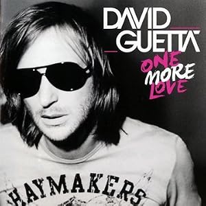
One More Love -..


Another popular effect is the album in black and white with selected parts in colour. Example, David Guetta, Lady Gaga and Adele's albums all use this effect. Example's album has the artists name surrounded by bright yellow which would make it stand out and easy to recognise. The rest of the album cover relates to the album name "Playing In The Shadows" as his face is split into two as though a shadow has been cast upon him. The background also switches from black to white, the reverse effect that is on his face. This creates two lots of shadows with one being on his face on the right hand side and the other being in the
background on the left hand side. 

Lady Gaga's "Born This Way" album consists of her face in black and white and instead of the album/artist name in colour, her lips are. The bright red of the lips has many connotations, the majority of them being centred around lust and seduction. These connotations could relate to the musical/ lyrical content of the album. Not a lot of attention if given to the titles, only to her face, and with her lips being almost exactly central, the audience's attention is drawn to that. Lady Gaga is well known for her unique sense of style and features and therefore, the album artist may have been confident that audiences would recognise her face enough to know that it is her album.

Both David Guetta and Adele's album both have both of their faces in black and white with only parts of the writing being in colour. David Guetta's album title alternates between pink and white and is in a completely different font to the artists name which makes it more distinguishable. By using pink, it also helps to make the album have connotations of fun, love and girls even though the photograph is of just him with a neutral expression. Adele's "21" album is very similar to her other album "19" with it being of her face. Her album "19" only shows part of her face whereas "21" shows the whole of her face along with her arm. It has a feel of classic beauty with her eyes closed and the focus being on her features which as highlighted through the contrast of black and white. The writing is in a thin font in white and then changing to green subtly, this and the photograph of her, create an image of subtlety in contrast to David Guetta's album where the album's writing creates a more bold feeling. 

Duos:

Sorry For Party RockingStereo Typical

Both LMFAO and Rizzle Kick consist of two members, both of which are portrayed on the album cover. LMFAO's album is very busy with a large title in a bright coloured and bold front. It has a range of colours (purple, yellow, black, white and pink mainly) which all create a hectic feel to the album which relates to the album name "Sorry for Party Rocking". By having the artist name so big and slanted also adds to the partying feel. The album cover creates the fun, party feel with a female torso being the focal point of the cover. Both of the members of LMFAO are pressed against the body and their expressions suggest tiredness and alcohol. Rizzle Kicks' album cover is of the both of them staring straight ahead as though they aren't actually there. Their clothing blends into the background as does the artist title. The only thing that stands out is the album name "Stereo Typical" which relates to the image as they are blending in rather than standing out. This contrasts to other albums such as LMFAO's.
In Case You Didn't KnowLoud

Because there is only one main character in our music video, we decided to have just  her on the album cover. We have played around with different shots of her varying from an close up to an extreme close up. She is going to wear the leopard print outfit which she is seen in leaving her house and at the party. We wanted to include some other elements that were in the music video such as bubbles and streamers to link the two. 


Through this analysis, I noted several conventions that are commonly used on album covers:
  • The main photograph is of the album's artist. This is because audiences make the link between the name(s) and face(s) of the artist(s). 
  • The name of the artist and the album is displayed so that people know who's album they are buying and which one is it. Because "Bounce" was release as a single, the albums' title is the title of the featuring song.
  • There is usually a strong contrast between the background and the main photograph (which is shown especially in Jessie J's album).
  • The writing must stand out against the background through different/unique fonts as well as colours. 
My plan:

I tried to include all of these conventions into my album cover by having the main character of my music video on the front. She is seen wearing the same outfit as in the music video so that it is easy to relate the music video to the album cover. I made the background quite dark to create a big contrast between the foreground and the background. The photograph and the writing on the album cover are both quite bright in comparison to the background making them stand out. The writing on the album cover consists of the artists, "Calvin Harris Ft. Kelis",  as well as the album title "Bounce". I put all of the text in white as it again creates the contrast but doesn't take away a lot of attention from the photograph. I chose not to use different colours as the simplicity of the white doesn't make it overpowering. I had a lot of attempts with different fonts before settling on a simple font for the Artists and varying fonts for the Title. I used varying fonts for "Bounce" as the song and music video are all about having fun. These are the fonts that I, as a teenager (my target audience), found most appealing and fun. The word "Bounce" means moving around and so the majority of the fonts have different sized letters and differ in some way.


 This is one of the designs that I played around with before coming up with my final design. I added on the stars and hearts that are later used in the rest of my DigiPak as it would allow it to flow but thought it looked too childish for an album cover.


This is the photo finally edited without any of the text etc. on it. It is a big change from the original. I have cut out the rest of the people in the photograph and changed the background to a dark blue to create a contrast. I then edited her face, getting rid of the red-eye and brought out the blue. I made the image brighter and applied "boost" to the colours making it stand out more. I also darkened and lengthened her eyelashes and hair so that it looked more like it does in our music video.
This is the original photograph I 
used.

April 2012

April 2012
During the Easter holidays, I have had a lot to do for my media coursework. 
  • I have completed the album cover needed for the DigiPak. Amber and I couldn't get together during the holidays and so I used a photograph off Amber's Facebook account from the social that we filmed in December to use. I cut out all of the other people and edited to how I wanted it to look. I added the album and artists names on there as well after having a play with various fonts, colours and positioning. 
  • I have also completed the rest of the DigiPak. I again used a photograph off Amber's Facebook account and edited on a website called Picnik which allows me to edit and manipulate my photographs easily. I used this photograph of her laying in the grass as she looks like a typical teenager having fun with is something that our target audience strives for and it also plays to their ideologies. I added a lyrics panel, back panel and another random panel. The whole DigiPak runs smoothly by having the same colour theme and fonts running throughout. 
  • I scanned and uploaded the sketches I did for the storyboard, album cover, DigiPak cover and the Album's magazine advert.
  • I did the whole of the evaluation by myself which took me a couple of days to complete on Prezi. It now has all the information as well as relevant pictures and screenshots. I just want to upload footage of Amber and I talking about our music video and include clips of our music video since I am not able to do it from home. 
  • I have also done the magazine advert for the album using Picnik again for different fonts and used one of the photographs that I included in the DigiPak to make a connection between the two. 
I was able to finish off the music video, however, because we had the extended version of the song, we had to cut out a part of the song. We asked our teacher if it was okay and she said that it was as long as it wasn't noticeable, which it isn't. I managed to fix the scrapbook theme and it now all works correctly. I also edited some of the lyrics over the top to make the timing a bit better. 

Now that it is finished, we have finalised it and it has been burnt to a disk. I have added our video onto YouTube and also onto my evaluation. 


For our evaluation, we have also recorded ourself answering some of the questions and I have now finalized the projects and uploaded them onto YouTube so that they can be seen on my evaluation.

March 2012

March 2012
 On the 2nd, I spend the majority of the day editing the ending of the video. I used the transition "Ripple" to make it look blurry and as though she is coming in from the night out and is drunk. It made everything blur into one and shows the shots in the beginning of the video. I also used this transition in the beginning in order to show a flashback to the night before. We had already previously agreed that a certain part of the song is ideal for the flashback moments and so I had to time the clips perfectly to the music. I also added the lyrics in different fonts so they  randomly occur during parts of the video. I played around with different fonts and colours to make each one look unique and interesting. This is an idea that we got from the "Who's That Chick" video we watched. 
On the 5th, we were changing the fonts of the lyrics and the colour to make it more interesting and fun. I added some different transactions to the text, for example, there is a part where it comes up glittery in the middle of the screen which reminded me of a party so I thought it was relevant.  
On the 9th, we showed our teacher what we had done so far and she made a coupe of suggestions on how to improve it. We still don't have the end part of our music video done as we need certain footage, but we will be able to get it over the next week or so. Ms Mitchell made some suggestions about the lyrics being brighter but was overall happy with it so far. We took what she said on board and so we changed the colouring of some of the fonts where we all thought was relevant. We also showed some of our classmates and the overall reception of it was positive.
On the 12th, we were shown how to use Prezi, a presentation site. We decided to use this for our evaluation and made a start on that. We decided to use Prezi as we can have a mixture of text, footage and pictures which would allow us to give examples of what we are referring to. We decided to write down all of our answers and then record some so that there is a visual of us explaining and also of the footage we are talking about. 
Up until the 30th, I have been working on our evaluation on the Prezi website and doing last minute editing to our music video. I spotted a problem when playing our music video. The scrapbook theme that I had added a few weeks ago is no longer working correctly. It used to show random stills of varying parts of the music video to make it seem like it is moving from one point to another but now it doesn't show the stills. This is something that I have been trying to work out but haven't been able to fix yet.  I have already done a design for the album cover (a part of the DigiPak) and have previously done the research for it. I just need a photograph of Amber for the middle and then that is finished. Amber is in charge of the Magazine advert.

February 2012

 February 2012
With the majority of our filming done, we now just have to continue to edit it. We added the music (which we got off iTunes) onto the footage so that we could match the footage to particular parts in the song to build up the story. We have been working on the editing a lot, trying to get everything in the right place and making sure that the music video can be followed easily by the audience. The beginning is complete with the still shots of night before as well as a introduction. I found a scrapbook effect of iMovie which I thought looked more interesting than the previous transitions that we had and used this throughout as well as the introduction. It has made it look a lot more exciting that previously and relates well to our audience as the young adult audiences are most likely to make scrapbooks, especially females. I thought that the scrapbook transitions made it more story-like.

January 2012

January 2012:
We did the majority of our filming as soon as we arrived back to sixth form after Christmas break. We spend a day filming at Amber's house to do the shots of her in the bath and in her room. We got lots of decorations and spread them out throughout her room in order to make it look like the after effect of a party. We used:
      Balloons
      Party Poppers
      Glitter
      Alcohol Bottles
      Alcohol crates
      Streamers

We captured different shots of her room in order to make it seem more interesting. We put the camera on top of a wardrobe to get a high angle view of Amber B when she was sat on her bed. This looked interesting and we included this clip into our flashback in the beginning of our video. We tidied her room and got some clips of her room in a tidy state to get the "before the party" clips. We do need to get more footage of Amber B getting ready and going out. We filmed the bottles using a jump-cut effect and edited it so each time the bottles moved, it was in time to the music and was in different colours to make it seem more exciting. We used the convention of lipstick on the mirror as well which we were happy with as we identified it as one of the effective conventions is the music videos we had seen in the beginning of term.


After getting the footage, we found that we had a lot to do. We have been editing the footage we got the other week and have been adding it to the sequence of our music video. We decided that some of the shots we got of Amber in the bath were perfect for the beginning stills showing the night before. We plan to use these stills in the beginning and the end to signify that this is the scene in the beginning before the "flashback to the night before".